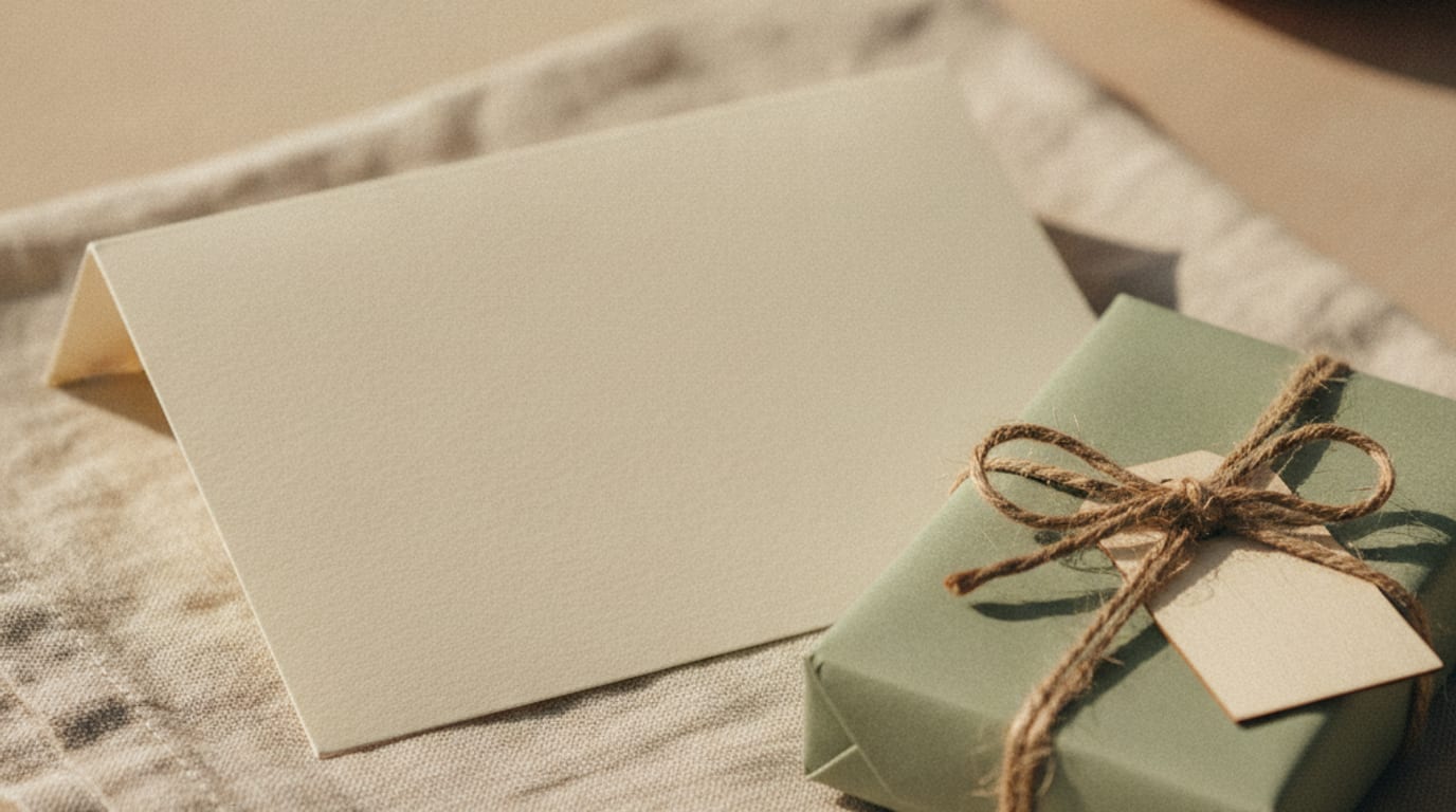
The invitation has one job: get people to the party with the secret still sealed. Date, time, place, and who is hosting. Nothing on the card should let a guest guess before they walk in. If the envelope already feels like an answer, the design has done the reveal’s work for it.
I design gender reveal invitations as digital files. A print-ready PDF at 300dpi with bleed and crop marks, a texting size, and a stories size. I don’t print, mail, or host the afternoon. The card isn’t the moment. It’s the door to the moment.
The invite is not the reveal
A good card is slightly quieter than the party. That’s the whole point.
People reach for the invitation when they want the room to feel ready. Pink and blue split down the middle. A script that reads like a punchline. A photograph that already knows. Those choices make a handsome object. They also spend the surprise on the kitchen table, while someone is still looking for a parking space.
Treat the invite as logistics with a little warmth. The names. The hour. A line that says there will be a reveal, without saying what will be revealed. Then stop. Sentences for that line are on my gender reveal invitation wording guide. Colour, type, pictures, and the file you send are the parts that leak even when the wording is careful.
I’m not the person who holds the envelope from the scan, or the person who bakes the cake. I’m the person who decides whether the card telegraphs. When a host and I start custom invitation design, I ask for the date, the occasion, a general vibe, and one photo of something they love. I don’t need to know the answer. Often it’s better if I don’t. Then nothing I set on the page can lean towards it by accident.
If you already know, keep it off the brief you send to anyone who will see the card before the party: the printer, the friend laying out the table, the aunt who offered to text the file. The invitation list is wide. The secret shouldn’t be.
A collection design, personalised by hand with your details, is $65. A single custom invitation designed from nothing is $285. Neither one has to look like a clue. Neutral paper can still feel considered. Quiet type can still feel like a celebration. The party is allowed to be louder than the mail.
Colour and type that give it away
Colour is the fastest leak. A guest doesn’t need to read a word. They see a wash of baby blue, or a blush panel, or a split of both, and they start placing bets in the group chat.
You don’t need a survey to watch this happen. Pale pink reads as a vote. Pale blue reads as the other vote. Gold and cream read as a party. Sage, sand, charcoal, and warm white do the same work without taking a side. If the nursery is already painted, that’s a later room. It doesn’t have to be the card.
Type leaks more quietly. A very round script on the names, paired with a tiny bow, will do as much as a colour. A heavy condensed sans with a sports cue will do the other half. I set names so they look like names, not like a team announcement. If you want a longer pass on how lettering behaves, I wrote about type on invitations separately. The short version for this party: pick one good face, set it at a size people can actually read, and leave the punchline off the page.
Two colours that sit next to each other can still spoil it. A navy header over a blush footer is a sentence. A guest will finish it. If you love both, use them on the day, on napkins and cake, once the answer is public. The invite can borrow the cream and the dark ink only.
Screens lie about colour, too. What looks grey on your phone can print as a cool blue. What looks beige can print as a dusty pink. I wrote about colours that lie on paper because this is a press problem, not a fussy one. Ask the printer for a proof. Look at it in daylight. If the proof leans, change the mix before you print a stack.
For most invitations I tell people to ask a printer for 110lb cover stock with an uncoated finish. Uncoated ink sits in the fibres. It looks like paper, not like a poster. That helps when you’re trying not to shout.
What guests need before they arrive
They need to know they’re invited, and they need to get there.
Write the hosts. Write whose news it is. Write the day of the week as well as the date, the start time, and the full address. A park with no pin in the map isn’t an address. A restaurant with two rooms isn’t finished until you name the room.
Then tell them how to reply, and by when. A phone number or an email is enough. I don’t run guest lists or host RSVPs. That sits with you, in whichever thread you already use.
If the gathering is outside, say so. If it runs into the evening, say so. If children are welcome, say so. If they aren’t, say that too, kindly and once. Guests can’t guess a dress note from a blank card, and they shouldn’t have to.
A short, honest list is better than a pretty one:
- Put the date, start time, and full address on the front or the first screen, not only in a caption under a photograph.
- Name one way to reply, and give it a day, so people aren’t guessing which aunt is counting heads.
- Say if guests should plan to stay for a particular hour, without describing how the news will appear.
- Add a gift line only if you have a real preference. Silence here is also a choice.
I won’t tell you that presents are expected or that they aren’t. Families differ. If you want none, a single plain sentence saves your guests an errand. If the reveal sits inside a shower, the card has to carry both jobs: where to come, and whether a present is part of it. It still doesn’t have to carry the answer.
Two to three weeks is comfortable for most of the work I do. A week is doable. Two days is a rush, and the rush fee on invitations is $95 for a 48 hour turnaround. That’s the studio clock, not a rule about when your guests must see the card. Build in time to check a printer’s proof if you’re printing. Build in time to resend a file if the address changes.
The invite can mention that the news will be shared in the room. That’s enough. Leave the rest for the garden.
Themes and photos that leak the answer
A theme is a leak when it only works for one outcome.
A slogan that only fits one answer is a sentence on the envelope. So is a crown, a tutu, a hunting-camp motif, a ballet slipper, anything that can’t survive the other result. If you already love a theme, hold it for the day-of paper, once the room is allowed to know. The invitation can share a feeling instead: late summer, backyard, Sunday lunch, candles at dusk. Feeling doesn’t take a side.
Photographs leak in three common ways. The ultrasound with writing in the corner. The nursery that is already one colour. The older sibling dressed as a clue. Any of those can be a lovely picture after the party. On the card, they read as a spoiler to anyone paying attention, and plenty of people are.
A photo of the two of you, or of a house, a table, a landscape, is safer. Crop tightly. Keep text off the image. If you send me a picture you love, I’ll use it as a tone, not as a riddle. I design in a direction. I won’t copy another card, and I won’t build a collage of stock babies in pink hats.
Bows, bats, cake, and the rest are day-of problems. They need space, weather, and a person who already knows. None of that has to be illustrated on the front of the card. A guest who needs boots because you’re in a field can be told the garden, and to wear shoes they don’t mind. They don’t need a drawing of the moment.
If you’re combining this gathering with a shower, keep a one-sided shower motif off the reveal half of the wording. One card can do both. It can’t do both and still be a secret if the shower artwork has already chosen. Cream, type, and a clear timetable will get people through the door. The cake can argue later.
Sending a file when the list lives in a chat
A lot of these parties are organised in a thread. There’s no formal list. There’s a group of names and a plan to forward a picture.
That’s a real way to invite people. It’s also how a secret dies. Someone screenshots a print file, the crop takes the names and leaves a blue panel, and the panel does the talking.
I deliver digital and paperless invitations as files in one shared folder, with no app to install. You get a print-ready PDF at 300dpi with bleed and crop marks, a version sized for text messages, and a version sized for Instagram and Facebook stories. Send the texting size to the chat. Don’t send a photo of a printout on your kitchen counter. Lighting will shift the colour, and a cropped edge will drop the words guests actually need.
If you want the mechanics of that size, I wrote how to size an invitation for texting. The useful rule is simple: the names, the time, and the address have to survive a phone held at arm’s length. Files go to a phone in any city. San Diego County clients can meet in person on anything over $285.
Digital and paperless invitations are from $225, with a 7 day turnaround, or 48 hours as a rush. Custom work on a single invitation is 7 days. The files are yours outright, forever, with no licence and no per-use fee. They’re also flat. You can’t open them and change a name yourself. If a cousin is added on Thursday, send me the change as a round of revisions. A custom invitation includes two rounds. Send everything you want changed at once.
I don’t track who opened the message. I don’t host the reply form. If your list lives in a chat, keep the reply route in the same chat, and put that route on the card so a forwarded copy still works. A file that only makes sense inside one thread will fail the moment it’s saved to a camera roll.
Printing, if you want paper, is yours to arrange. Any local print shop, or an online printer for a larger run. You pay the printer directly, so there’s no markup from me on card stock. That is the honest version of a modest card: you’re not buying a printed pack from me, because I don’t sell one.
The quiet file is the one that still works when it’s forwarded twice, opened in daylight, and read by someone who only has thirty seconds. That’s the file I want to send you.
The party gets to be the loud thing. The card can be the calm one. If a guest arrives not knowing, the invitation did its job, and you still have an afternoon in front of you.