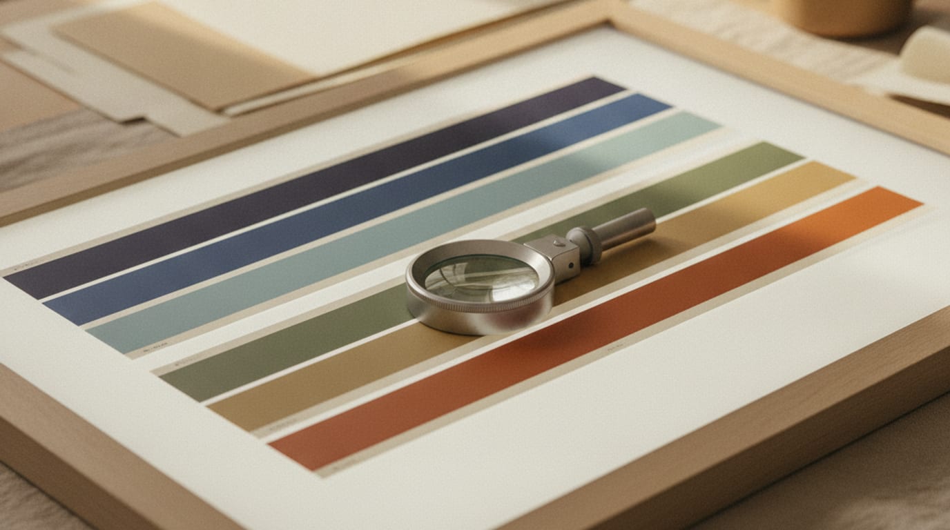
A screen makes colour with light and a printer makes it with ink, and those two systems can reach different places. Some colours your monitor shows you cannot be printed at all, which is why an invitation occasionally comes back looking flat, muddy or the wrong hue entirely, with nobody at fault.
Your screen builds colour by adding light: red, green and blue emitters, brightest at white. Ink does the opposite. It sits on paper and subtracts light, absorbing some wavelengths and reflecting the rest, and it starts from whatever the paper already is. The two ranges overlap in the middle and diverge at the edges. The edges are where the trouble lives.
The specific colours that behave badly
Bright, electric blue is the most common disappointment. That vivid cobalt or royal blue you picked on screen is being made by a blue emitter running near full brightness, and print has no equivalent. What comes back tends to lean purple or slate. It is not wrong, it is the closest the ink can get, but it is not what you approved.
Neons and fluorescents are worse, because the screen versions are borrowing brightness rather than pigment. Hot pink, acid green, that particular safety orange. Standard printing cannot make a colour that appears to glow. It can make a strong pink, and a strong pink is a good design decision, but it will not have the buzz of the screen version. If a neon really is the point, printers can run a fluorescent spot ink, which is a separate and more expensive process worth asking about before you commit.
Deep, rich black is the one nobody expects. Black printed with black ink alone often reads as a soft charcoal, especially across a large filled area. The fix is a mix, sometimes called a rich black, where a small amount of the other inks sits under the black to give it depth. That is a file decision, made by the person building the artwork, and it is one of the reasons a print-ready PDF is not the same object as the JPEG you were shown.
Very pale tints go the other way. A blush you can barely see on screen may vanish on a warm paper, or it may print noticeably stronger than expected because the ink dot pattern lands differently on that stock. Pale colours are the ones where a proof earns its cost fastest.
Paper changes every colour on it
This is the part people underestimate. The paper is not a neutral background, it is the first layer of the colour.
Print the identical file on bright white card and on cream card and you get two different invitations. On cream, every colour warms. Your sage goes a little olive, your blush goes a little peach, your grey goes brown. Sometimes that is exactly what you wanted, and cream is the right choice for a warm, soft suite. But it is a decision, not a default.
Texture matters too. A smooth, coated sheet holds ink on the surface, so colour sits bright and crisp. A soft, uncoated or cotton sheet absorbs ink into the fibres, so the same colour reads softer, slightly lighter and a touch fuzzier at the edges. Cotton stock is beautiful and it is why letterpress looks the way it does, but if you chose your palette against a coated sample and then printed on cotton, everything will be gentler than you planned.
And then there is the light in the room. Colours that match under a warm kitchen bulb can separate under daylight. If you are matching an invitation to a real object, a fabric swatch or a ribbon, compare them near a window rather than under a lamp.
Why your screen and mine disagree
Even before ink is involved, two screens do not agree. Phones ship with saturated display modes that make everything more vivid. Laptops are usually cooler and brighter than desktop monitors. Any screen in night mode is actively shifting everything warm, and I have had people approve a palette at eleven at night and query it the next morning, having seen the same file twice.
So when you send me a screenshot as a colour reference, I read it as direction rather than as a target. It tells me you want a muted blue-green. It cannot tell me which one, because I cannot know what your screen did to it on the way.
The reference that does work is a physical object. Send me a photo of the ribbon, the tile, the dress fabric, the flowers, or better, tell me the paint name if the colour came from a wall. Physical things have a fixed colour I can look up or match to, and matching a real object is one of the few reliable ways to get from your head to the paper.
What a proof is, and what it is worth
A printed proof is one copy of your invitation, produced by the printer who will produce the rest, on the stock you have chosen. You hold it. You look at it in daylight. You put it next to the ribbon.
That is the only test that settles the question. Everything before it is inference. And the reason to pay for one is straightforward arithmetic: a proof costs a small fraction of a full run, and finding a colour problem on a proof costs you a few days, while finding it on a hundred and fifty finished invitations costs you the entire print.
Order the proof when any of these are true. You have chosen a bright or a very pale colour. You are printing on cream, coloured or textured stock. There is a large area of solid colour, particularly a dark one. You are matching a physical object. Or the money at stake is enough that you would be genuinely upset to be wrong, which for a wedding suite is most people.
How I set the files up
The files I deliver are built for print rather than for screens: the correct colour space, the black mixed for depth where there are solid areas, and bleed allowed at the trim edge so nothing important sits where the guillotine lands. I will also tell you honestly when a colour you have asked for is at the edge of what ink can do, and what the printed version will most likely look like.
For party printables coming off a home printer, I aim slightly differently, because a desktop inkjet on ordinary card is a different animal again and tends to run warm and heavy in dark areas.
What I will not do is promise a screen match, because nobody can. What I can do is give you a palette that survives the trip, which usually means colours a little away from the edges: muted rather than electric, and chosen with your paper already decided. Bring me the stock and the palette at the same time, and most of this problem never happens.