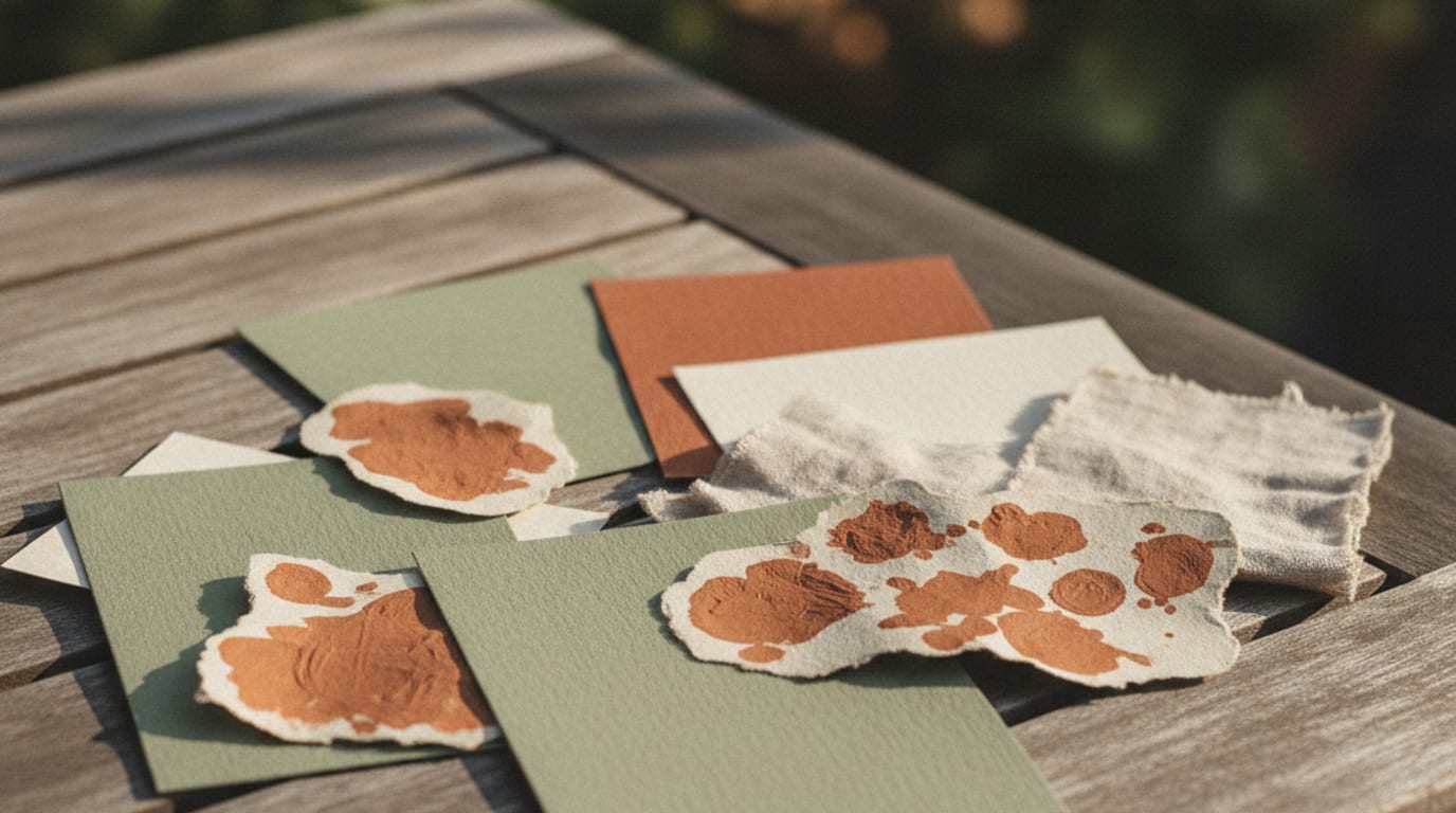
Send me a photograph of the room. Not a mood board, not a colour name, not a pin of somebody else’s wedding in a different building. A photograph of the actual space your guests will stand in, taken at roughly the time of day your event happens.
A mood board tells me what you like. A photograph of the venue tells me what your guests are going to see, and those two things are different often enough that it is worth taking seriously.
Mood boards drift, rooms do not
A mood board is a collection of images that appealed to you over several months. It has no obligation to be coherent, and it usually is not. Twenty saved images will contain three or four separate palettes, and the one that dominates is whichever had the most saturated photography, not the one you actually want.
The bigger problem is that the images were shot elsewhere. That gorgeous pale grey scheme was photographed in a white-walled studio in northern light. Put it in a room with oak panelling and warm bulbs and the grey turns brown, because every colour in a room is being tinted by the light and by every other surface in it.
The venue does not have this problem. It is one room, with one set of surfaces, under known light. Whatever you choose has to coexist with the floor, the walls, the woodwork and the chairs, and none of those are negotiable on the day.
Which is not to say your taste stops mattering. It decides which of the room’s colours you pull forward and which you leave alone. The room narrows the field to colours that will not fight; you choose within it.
What to photograph
Aim for four or five images, taken on a phone, with the flash off:
- The room empty, wide, from the entrance where guests will first see it.
- The floor and the walls close up, in the same frame if possible.
- Whatever is out of the window, if there are windows, because that light is in the room.
- Any large fixed object with a strong colour: a bar, a stage curtain, a carpet, brickwork.
- Anything you have already committed to. A flower sample, a bridesmaid dress, a linen swatch, the cake.
Two conditions matter more than image quality. Shoot at the hour of day your event starts, because an afternoon room and an evening room are different colours. And turn the flash off, because flash flattens everything and replaces the room’s light with its own.
If the venue is only available for a viewing at the wrong time of day, tell me that. It is easy to compensate for once I know.
Pulling colours out of the photograph
The instinct is to eyedropper the prettiest pixel. That gives you a colour, but rarely a usable one, because a single pixel is contaminated by whatever light hit that exact spot.
Better method, and you can do it in any phone photo editor with a colour picker:
Sample the same surface in three different places, one in light, one in shadow, one in between. You now have a range rather than a point, and the middle of that range is much closer to what the surface actually is. Repeat for the floor, the walls and one feature.
Then look at what you have. Nearly always, two of them are close to neutral and one is the room’s actual character. That character colour is your starting point, and the neutrals are your background and paper tone.
The final move is the one people skip. Desaturate whatever you pulled by a noticeable amount. Photographs, especially from phones, add saturation, and a colour sampled straight from a photo prints stronger than the room looks. Backing it off keeps it recognisable as the room rather than as a brighter cousin of the room.
Building three colours out of it
An invitation wants three colours and no more: a paper tone, an ink, and one accent. That is a constraint, but it is also the reason well-designed invitations look calm.
From a venue palette, the assignment usually falls out naturally. The wall or floor neutral, lightened, becomes the paper tone. The darkest thing in the room, the woodwork, the ironwork, the shadowed corners, becomes the ink, and it should be a deep warm or cool near-black rather than actual black. The character colour becomes the accent, used sparingly.
Sparingly is the operative word. An accent that covers half the card stops being an accent and becomes the design. Used on one line, one rule or one small illustration, it does more.
There is one deliberate exception worth knowing about. If the room is very neutral, a converted warehouse, a white gallery, a plain marquee, then the room gives you no character colour at all. In that case take it from the flowers, or from the season outside, and let the room be the neutral background it is trying to be.
Where this pays off
Two places, mostly.
The photographs. Guests hold the invitation at the venue, in front of the flowers, on the table. When the palette came from the room, those pictures look composed without anyone arranging them. When it came from a mood board, there is a slight clash that nobody names and everybody sees.
And the decisions afterwards. Once the palette is genuinely tied to the room, every later choice, ribbons, napkins, signage, the day-of paper, has an obvious answer instead of being relitigated. That is worth more than the invitation itself.
So when a project starts here, the first thing I ask for is not references. It is a photo of the room, and anything you have already bought, sitting in that room’s light. Matching a real object beats matching a described one, every time, because sage means about nine different colours and a photograph means one.