Fall festival flyers
The design problem here is abundance. Fifteen activities, four food vendors, a bounce house and a cake walk, all wanting the headline.
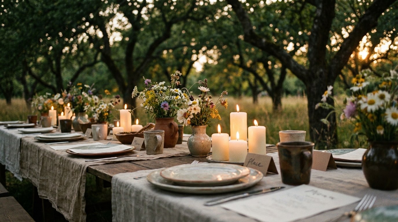
A fall festival flyer fails in a specific and predictable way: everything on the page is given equal weight, because every activity belongs to a volunteer who wants it listed. What arrives is a wall of small text, and a reader scanning it on a phone gets no sense of what the event actually is. The organiser then wonders why turnout was flat despite the flyer being everywhere.
The fix is editorial rather than decorative. Pick the two or three things that would make a family decide to come — usually the ones the children will ask for — and give those the space. Everything else becomes a single readable line: "plus a cake walk, hayrides, face painting and a chilli cook-off". Nobody is excluded, and the page becomes legible.
The money questions need their own block. Free entry with paid wristbands, tickets for games, cash-only food stalls, whether there is an ATM: these are the things a parent with three children needs settled before they leave the house, and a flyer that leaves them ambiguous costs attendance from exactly the families the event was for.
$125
Flat, for one flyer designed for your event. Print-ready PDF tested in black and white, an email version, and square and story sizes. One round of revisions, back in four days.
Where this flyer actually lands
School bags and church bulletins, local shop windows, and community groups on social. Often re-shared by a town page or a local parents' group, which means the version that travels furthest is the square image, cropped from a portrait sheet by somebody who is not looking at what falls off.
What changes for this one
Two or three headline activities get real space; the rest becomes one line of supporting copy. A dedicated block for cost, wristbands and whether it is cash only. Warm autumn palette that still holds contrast in a black and white photocopy.
What it has to carry
- Date, start and end time
- Entry cost and how wristbands or tickets work
- Whether food is cash only
- The two or three headline activities, prominent, with the rest in a single line
- Rain plan or rain date
The mistakes worth avoiding
- Listing fifteen activities at equal size so none of them registers.
- Leaving wristband pricing off, so parents cannot plan and some do not come.
- Not stating whether food stalls take cards, which in practice they often do not.
- Designing portrait only, then losing the date when somebody crops it square for social.
- Skipping the rain date on an outdoor October event.
Questions people ask
How do we fit everything on?
You do not, and that is the point. Two or three headline activities get space, the rest becomes one line. Attendance follows legibility, not completeness.
Can you do a matching banner or yard sign?
Yes, as files set up at the right proportions. You take them to a local printer. This studio does not print or ship anything.
Do you include a version for the school newsletter?
Yes, a horizontal crop laid out for a newsletter column comes with it, since that is usually where half the audience actually sees it.
When should it go out?
Three to four weeks before, with a reminder version a few days out. October weekends fill up early, especially for families.
590
US searches a month for fall festival flyers, measured rather than guessed.
- trunk or treat flyer · 1,000/mo
Event flyer design
For schools, churches, studios and anyone running a calendar.
From $125